The Challenge
Parkside Church is a complex organization, with many diverse ministries serving people in the Cleveland area. Their website was correspondingly complex.
In their attempts to serve everyone from employees to attendees, Parkside Church had layered content onto their site in a way that had become cumbersome and overwhelming over the years. Because of that, updating the site became challenging, and the site’s visual design was no longer consistent with their offline presence.
Agathon was already serving Parkside Church through providing cloud hosting and web support services. With that foundation of trust, they reached out to us first when it was time to refresh their website.

One of the things we’ve been looking for is to be able to trust in the group that we work with. So that team needs to be competent, and Agathon is. And the team needs to be able to understand our needs, and Agathon does. They do their best to sit with us and get to the bottom of a problem and really work that through with us.
Jonathan Cameron Pastor of Communications, Parkside Church
The Process
Parkside Church knew their website needed streamlining to better serve the needs of each of their users. Our job was to help them recognize and empathize with these needs.
We began the Strategy process by conducting a Discovery session. Over the course of several days of onsite meetings, we collaborated with the Parkside Church team to build five personas that served as sample website users. Then, we worked together to map out each persona’s journey through the site. Using this new perspective, the team went through a card-sorting exercise to reorganize the website’s existing content to fit each persona’s needs.
This user-centered approach led to two key insights.
The existing website content was valuable, but needed to be reorganized to serve its users.
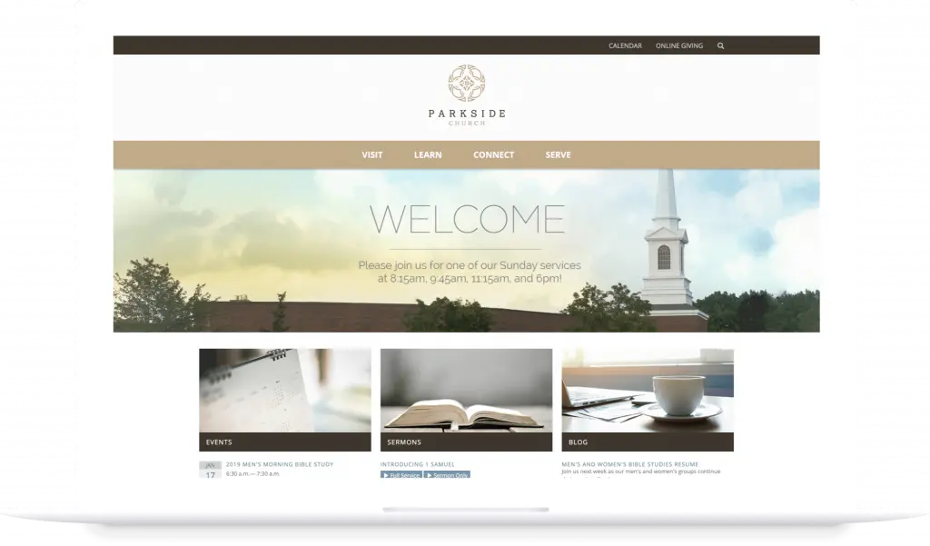
In looking at their website through the lens of their users, the Parkside Church team found new patterns in their existing content. This allowed them to reorganize everything from seven main navigation items down to four: Visit, Learn, Connect, and Serve.
This approach addressed a particular barrier for new attendees, who had struggled with what to expect on their first visit.
Users needed new site functionality to connect with the content they wanted in an efficient and effective way.
Parkside Church’s website redesign needed to pivot to be mobile first, as the site’s mobile traffic was on the rise. It also needed a more functional events and ministry calendar that allowed users to browse events by week and month, or specific ministry.
How It Worked
Because Parkside Church understood the importance of empathizing with their users while redesigning their website, we were able to work together to research, design, and build an end product that serves everyone more effectively. As a result, the new website helped Parkside Church’s pageviews grow by 38% and new users to the site grow by nearly 50%.

The new Parkside Church website also provides users with the following:
- A user-focused and mobile-first experience.
- Simplified navigation so everyone can find what they’re looking for quickly.
- Easily discovered content that helps new attendees feel ready for their first-time visit.
- Functionality that enables all users to easily find the event information that’s relevant to them.
- A visual design that reflects the offline experience of the church.
Parkside Church is best positioned to understand whom they serve. Our role was to help them apply what they do so well offline to their digital presence. By focusing on their users’ interests, we were able to help them feel confident about making these significant and necessary changes.
We worked together to build a website that serves all of Parkside Church’s stakeholders simply and effectively.
